


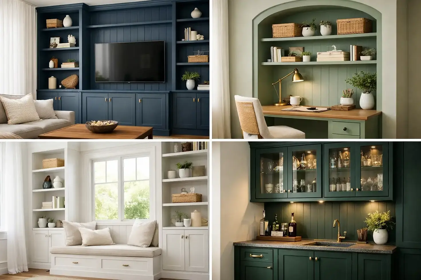
12 Painted Built-Ins Ideas That Look Custom
A built-in can either quietly disappear into the room or become the detail everyone notices when they walk in. The best painted built ins ideas do more than add color: they give ordinary storage a sense of permanence, proportion, and personality. Whether you are updating living room bookcases, a dining room hutch, a mudroom drop zone, or a home office wall, the finish needs to feel intentional from every angle.
For Chicago-area homes, built-ins often sit beside original millwork, stone fireplaces, or rooms with limited natural light. That makes color selection, surface preparation, and sheen far more consequential than they would be on a single accent wall. A beautiful result is not just about choosing a compelling paint chip. It is about creating a finish that belongs in the architecture of the home.
Why painted built-ins change a room
Built-ins take up visual real estate. When they are painted the same flat white as the walls, they can look unfinished or overly new, especially in a room with warm floors, layered furnishings, and older trim. Painting them in a distinct color creates depth and makes the cabinetry read as a considered architectural feature.
There is also a practical benefit. A deeper color can hide the visual clutter of books, media equipment, and family photos better than a bright white interior. A carefully selected finish makes a hardworking piece of storage feel polished even when it is being used every day.
The trade-off is permanence. A dramatic built-in color has more impact than a colorful pillow or rug, so it deserves a little restraint. The right choice should work with the room at night, in morning light, and during the gray winter days that are familiar across Chicagoland.
Painted built-ins ideas for every style of home
Go tonal for a quiet, architectural look
1. Match the wall color in a different sheen. Painting built-ins the same color as surrounding walls, but in satin or soft semi-gloss, gives the room subtle dimension. It is a strong choice for traditional rooms where you want the millwork to feel original rather than newly added. The sheen catches the light just enough to define the cabinet doors, shelves, and trim.
2. Use a soft contrast color. Choose a built-in color that is one or two steps deeper than the walls. A warm mushroom wall paired with taupe cabinetry, for example, feels refined without creating a hard border around the storage. This is especially effective in bedrooms, offices, and rooms where calm matters more than drama.
3. Carry the trim color onto the built-ins. If a home has beautiful existing window casings, crown molding, or paneled doors, matching the built-ins to the trim creates cohesion. The cabinetry becomes part of the millwork family. This approach works best when the existing trim finish is worth preserving and the new paint can be carefully matched in undertone and sheen.
Use depth where the room needs it most
4. Paint the cabinet exterior a moody neutral. Charcoal, deep olive, ink blue, and warm black can make built-ins feel grounded beside a fireplace or on a large living room wall. These colors provide a strong backdrop for lighter books, brass objects, and framed art. In a smaller room, keep the surrounding walls lighter so the cabinetry adds depth without making the space feel closed in.
5. Paint only the back panels. If you love the character of painted shelving but do not want an entire wall of color, paint the back of the bookcases and leave the face frames, shelves, and cabinetry in a neutral finish. This gives objects on the shelf a clear backdrop and adds dimension with less commitment. It is a particularly smart move for open shelving that is already well designed.
6. Choose a rich color below and a lighter finish above. Built-ins with lower cabinets and open upper shelves do not have to be one color. A darker base anchors the room and disguises everyday wear, while pale upper shelves keep the composition airy. The transition line should follow the cabinetry itself, not fall at an arbitrary height on the wall.
Let the built-in support the room's purpose
7. Make a home office feel tailored. Deep green, blue-gray, or earthy brown cabinetry can give a home office the presence of a private library. Consider a slightly lower-sheen finish for a calmer look, then reserve a more durable satin sheen for desk surfaces and cabinet doors. The goal is professional and comfortable, not overly formal.
8. Add warmth to a dining room hutch. A muted terracotta, olive, putty, or dark wine shade can make a built-in hutch feel collected over time. These colors work beautifully with wood dining tables, antique brass hardware, and ceramics. Before committing, view samples near the dishes and serving pieces that will live inside the cabinet. What looks warm next to an empty shelf may look completely different once the hutch is styled.
9. Give a mudroom a hardworking finish. Mudroom built-ins are ideal for confident colors because they receive plenty of wear. Navy, forest green, and medium charcoal are practical choices that still look elevated. Use a washable, durable cabinet-grade coating and make sure scuffs, caulk gaps, and nail holes are handled thoroughly before painting. No color can compensate for weak prep in a high-traffic space.
Create a focal point without overdoing it
10. Frame a fireplace with balanced color. Built-ins on either side of a fireplace can visually widen a room, but they should not compete with the mantel, surround, and hearth. If the fireplace has dramatic stone or tile, a quieter neutral or darkened version of the wall color often works best. If the fireplace is simple, stronger cabinetry color can provide the focal point the room needs.
11. Use color to make a niche feel intentional. An awkward alcove can become a handsome bar, reading nook, or display cabinet when it is painted in a distinct shade. The color tells the eye that the feature is purposeful. For small niches, saturated hues often read better than pale colors because they create clear depth rather than looking like a shadowy corner.
12. Consider a painted interior with natural wood details. Not every built-in needs to be painted edge to edge. Leaving wood shelves, a butcher-block work surface, or a stained interior visible against painted cabinetry creates warmth and material contrast. This approach depends on the quality of the wood. If the grain, stain, or previous finish is inconsistent, a full painted finish will usually look more deliberate.
Sheen and preparation make the color believable
On built-ins, sheen is part of the design decision. Flat paint can look elegant on walls, but it is rarely the best choice for cabinet faces, shelves, or areas that get touched often. Eggshell may work on purely decorative bookcase backs, while satin is a dependable choice for most painted cabinetry. Semi-gloss offers more reflectivity and cleanability, but it will also reveal brush marks, dents, and uneven repairs more readily.
That is why preparation matters so much. A professional-quality repaint begins with cleaning off oils and residue, dulling slick surfaces where needed, repairing damaged edges, filling holes, caulking appropriate joints, and applying the primer suited to the existing material. Oak grain, laminate, previously stained wood, and old oil-based coatings each call for a different approach. Skipping those details can lead to telegraphed grain, poor adhesion, or a finish that chips long before it should.
Hardware also deserves attention. Existing pulls and hinges may be worth retaining if they suit the room, but worn hardware can make freshly painted cabinetry look incomplete. If you plan to replace it, confirm the hole spacing before painting. A small hardware change made after the finish work can create unnecessary patching and touch-ups.
Let samples do the hard work before the paint does
Paint a large sample board or an inconspicuous section of the actual built-in, then view it for a few days. Look at it with lamps on, with window light, and against the flooring and upholstery. A blue that feels classic in a bright showroom may lean icy in a north-facing room; a black with a warm undertone may be exactly what a sun-filled room needs.
For a project this visible, thoughtful finishing is worth the extra care. Artist Painters approaches built-ins as furniture-grade architectural elements, with close attention to surface condition, sheen, clean lines, and the way the final color serves the room. Choose the idea that makes your storage feel less like an add-on and more like it has always belonged there.


