Best Colors for Kitchen Cabinets in 2026
- Gene Pellegrene
- 5 days ago
- 6 min read
A cabinet color can make a kitchen feel brighter, calmer, richer, cleaner, or more expensive - sometimes without changing anything else in the room. That is why choosing the best colors for kitchen cabinets is less about chasing trends and more about getting the balance right between your lighting, finishes, architecture, and how you actually use the space.
We see homeowners get stuck between two fears: picking a color that feels too safe, or picking one that dates the kitchen in a few years. The right answer usually lives in the middle. The best cabinet colors have personality, but they also work hard. They flatter the counters, hold up under morning and evening light, and still feel good after the novelty wears off.
What makes the best colors for kitchen cabinets work
A beautiful cabinet color on a sample chip can fall flat once it covers twenty doors and drawer fronts. Kitchens are full of variables: under-cabinet lighting, warm wood floors, cool stone counters, stainless appliances, and backsplash tile that reflects light differently throughout the day. That is why cabinet color has to be chosen in context.
Undertone matters more than most people expect. A white with a yellow base can look creamy and soft in one kitchen, then read dingy next to bright quartz in another. A gray-green can feel tailored and elegant, or muddy, depending on the natural light. This is where finish quality matters too. Premium cabinet refinishing does not just improve durability. It sharpens the color, smooths the reflection, and gives deeper shades a more refined look.
There is also the question of permanence. Wall paint is relatively easy to change. Cabinets are not. For most homeowners, the smartest approach is to choose a cabinet color with staying power, then bring in trendier elements through stools, hardware, lighting, rugs, or wall color.
White kitchen cabinets still earn their place
White remains one of the best colors for kitchen cabinets because it solves a lot of design problems at once. It brightens smaller kitchens, reflects limited natural light, and creates a clean backdrop for stone, tile, brass, black, or wood accents. In older homes, it can freshen original layouts without fighting the architecture.
That said, not all whites are equal. Crisp, cooler whites can feel modern and sharp, especially with clean-lined doors and minimal hardware. Softer whites with a creamy or greige base tend to feel warmer and more forgiving, which is often a better fit for traditional kitchens or homes with warmer flooring.
The trade-off is maintenance and contrast. White cabinets show splatter, fingerprints, and wear more readily than mid-tone colors. They also need the right surrounding materials. If your backsplash, counters, and trim all sit in slightly different whites, the kitchen can start to look accidental instead of intentional.
Warm off-whites and greige for a softer, high-end look
If bright white feels too stark, warm off-whites and greige tones are often the better move. These shades bring softness without making the room feel dark. They also play well with natural wood, unlacquered brass, aged bronze, and the warmer finishes that many homeowners are returning to.
This category is especially strong when a kitchen needs to feel elevated but not overly formal. A good greige cabinet color can bridge traditional and contemporary details, which makes it useful in transitional homes where you want the result to feel current without looking cold.
The caution here is muddiness. Some beige-gray paints lose clarity under artificial light. On cabinetry, that can make the whole kitchen feel flatter than intended. Sample boards are worth the effort because a color that seems subtle and elegant in daylight may turn dull at night.
Green cabinets have become a modern classic
Muted green has moved well beyond trend status. In the right shade, it feels grounded, tailored, and surprisingly timeless. Sage, olive, and gray-green are especially strong choices for homeowners who want color but do not want the kitchen to feel loud.
Green works because it behaves almost like a neutral. It pairs naturally with wood tones, marble-look counters, creamy walls, black accents, and warm metals. It can soften a kitchen full of hard surfaces and give the room more character than white or gray alone.
Deeper greens bring more drama and depth, but they need enough light and enough visual balance. In a small kitchen with low ceilings, a dark olive on every cabinet may feel heavy. In a brighter space, or when used on lower cabinets or an island, it can look rich and custom.
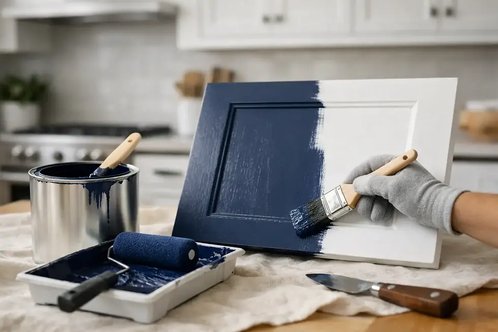
Blue cabinets offer depth without feeling severe
Blue is another dependable option, especially for homeowners who want something classic with a little more personality. Navy remains popular for good reason. It adds depth, looks polished with brass or nickel hardware, and holds its own against white counters and backsplashes.
Softer blue-grays and muted slate tones can be even more versatile. They feel calmer than navy and often age more gracefully than brighter blues. In kitchens that get strong natural light, these shades can look elegant and collected rather than trendy.
The key with blue is restraint. Highly saturated blues can overpower the room, especially when paired with busy stone or patterned tile. Blue also shifts noticeably with lighting, sometimes reading gray, sometimes vivid. That is not necessarily a problem, but it should be expected.
Gray is still useful, but it has to be the right gray
Gray cabinets are no longer the automatic answer they once were, but that does not mean they are out. A well-chosen gray can still look sophisticated, especially in homes with cooler stone, black accents, or contemporary architecture.
What has changed is the preference for cleaner, more nuanced grays over flat, lifeless ones. The wrong gray can drain warmth from the room and make the kitchen feel generic. The better grays now tend to have a subtle green, taupe, or blue influence that gives them more dimension.
If your kitchen already has a lot of cool materials, gray may need warming elements around it - wood stools, warmer wall color, softer lighting, or brass hardware. Without that balance, the room can feel harder than intended.
Black and near-black cabinets can look exceptional
For the right home, black or near-black cabinets are striking. They create contrast, add architectural weight, and can make simple cabinetry look more custom. Matte or satin black finishes, when executed well, feel especially tailored.
This is not the easiest path, though. Dark cabinets show dust, fingerprints, and finish imperfections more readily than many homeowners expect. They also demand strong prep and a flawless application. On cabinetry, every surface reflection tells the truth.
Used thoughtfully, black is often strongest on an island, lower cabinets, or a butler pantry rather than every cabinet in the room. That approach gives you the drama without closing in the space.
Natural-looking wood tones are back for a reason
Paint is not always the answer. In some kitchens, especially those with quality wood cabinetry or a more organic design direction, a natural-looking wood finish can be one of the smartest choices available. White oak-inspired tones, medium walnuts, and softened stained finishes bring warmth that painted cabinets sometimes cannot.
This works particularly well when the goal is to make the kitchen feel less sterile and more connected to the rest of the home. Wood also hides daily wear differently than paint. Instead of showing every mark, it tends to age with a little more forgiveness.
The difference between beautiful and dated usually comes down to tone. Orange-heavy stains can push a kitchen backward. Cleaner, quieter wood finishes tend to feel fresher and more architectural.
How to choose the best cabinet color for your kitchen
Start with the fixed elements you are not changing. Countertops, flooring, backsplash, and the amount of natural light should guide the cabinet color more than trend reports do. If those surfaces are cool, a slightly warmer cabinet tone may create better balance. If the room already feels warm and dark, a cleaner, lighter cabinet color may help it breathe.
Next, think about how the kitchen should feel. Bright and airy is different from warm and tailored. Crisp and modern is different from layered and classic. Those are emotional decisions as much as design ones.
Finally, look at the condition of the cabinets and the level of finish you expect. Cabinet color is only half the story. The other half is the craftsmanship behind the refinishing. A premium result depends on preparation, product choice, sheen control, and careful execution. At Artist Painters, we have seen excellent color choices look ordinary with rushed work, and restrained color choices look outstanding when the finish is done right.
The best cabinet color is the one that still feels right on an ordinary Tuesday morning, not just in a saved inspiration photo. If you choose with the room, the light, and the finish in mind, your kitchen has a much better chance of feeling polished for years to come.