


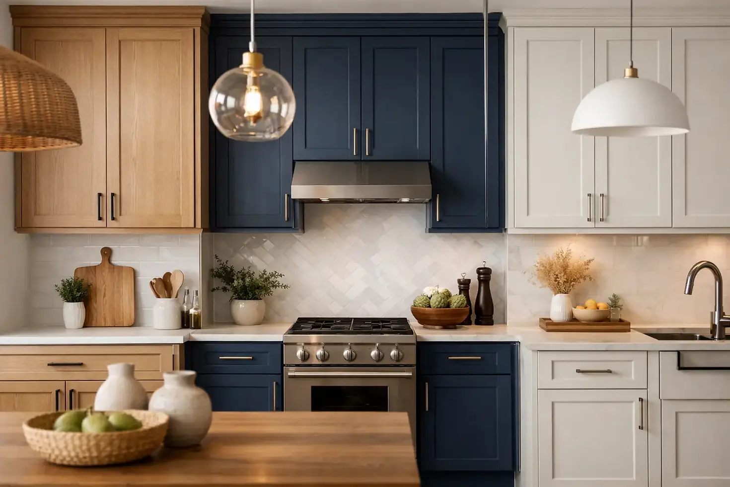
Kitchen Cabinet Color Trends That Last
A cabinet color can make a kitchen feel sharper, warmer, larger, calmer, or far more expensive than it did a week before. That is why kitchen cabinet color trends matter - not because every home needs the latest look, but because the right color choice can bring an entire room into balance.
For most homeowners, the real question is not what is trending on social media. It is what will still look right in two, five, or ten years when the counters, flooring, and daily wear tell the truth. In our experience, the best cabinet colors sit at the intersection of style, architecture, light, and finish quality.
Kitchen cabinet color trends are getting more grounded
The biggest shift in kitchen cabinet color trends is a move away from stark, one-note palettes and toward colors with more depth. Homeowners still want fresh, clean kitchens, but they are less interested in bright, flat whites that can feel clinical under certain lighting. Instead, they are choosing shades with subtle undertones - warmer whites, soft greiges, muted greens, and rich earthy hues that feel considered rather than trendy for trend's sake.
This change makes sense. Kitchens have become more visible, more lived in, and more connected to the rest of the home. An overly sharp cabinet color can stand out in the wrong way when your kitchen opens to a family room, dining space, or hallway. Softer, more nuanced paint colors tend to transition better from room to room.
There is also a practical side to this shift. Midtone and slightly muted colors are often more forgiving than bright white when it comes to fingerprints, minor scuffs, and the everyday traffic a kitchen sees.
Warm whites are still strong, but cooler whites are fading
White cabinets are not gone. They are simply more refined now.
The white kitchens that continue to look current usually lean soft and warm rather than icy. Think creamy whites, off-whites, and whites with a touch of beige or gray. These shades tend to work especially well with natural stone, unlacquered brass, warm wood flooring, and the mixed-metal hardware choices many homeowners prefer now.
Cool whites can still work, particularly in homes with a crisp modern aesthetic, but they are less forgiving. In north-facing kitchens or spaces with limited natural light, a cool white can turn flat or bluish. In older homes, it can also feel disconnected from the character of the space.
If you want a white kitchen, the goal is not just "white." It is the right white for your counters, backsplash, trim, and lighting conditions.
Green has moved from bold statement to classic option
Green cabinetry has become one of the most durable color trends because it brings color without becoming loud. The most successful greens are muted and grounded - sage, olive, eucalyptus, and darker smoky greens with gray undertones.
These shades work because they behave almost like neutrals. They pair well with wood, marble, black hardware, aged brass, and a wide range of wall colors. They can feel traditional, transitional, or contemporary depending on the door style and sheen.
There is a trade-off, though. Green is forgiving in many settings, but the wrong undertone can clash with fixed finishes. A yellow-green may look muddy next to cool quartz. A blue-green can feel colder than expected under LED lighting. Sample boards matter here more than people think.
Deep blues are holding on, but with more restraint
Navy and deep blue kitchen cabinets have had a long run, and they are still relevant. What has changed is how they are being used.
Instead of coating every cabinet in a saturated blue, many homeowners are keeping the color to lower cabinets or islands. That gives the room contrast and personality without making the kitchen feel heavy. Deep blue remains especially attractive in kitchens with good natural light, taller ceilings, or enough square footage to handle visual weight.
In smaller kitchens, dark blue can still be beautiful, but finish quality becomes even more important. A poorly prepped or unevenly sprayed dark cabinet color shows everything. Brush marks, surface flaws, and inconsistent sheen are much easier to spot on darker colors.
Earth tones are the quiet luxury move
If there is one category that feels especially current, it is earthy neutrals. Mushroom, taupe, clay, putty, and soft brown-toned grays are showing up more often in thoughtfully renovated kitchens.
These colors appeal to homeowners who want warmth and sophistication without obvious trendiness. They sit comfortably with natural materials and make a kitchen feel settled. They are also versatile in homes where the kitchen connects to living spaces with layered textures, antiques, or warmer architectural details.
Earth tones are not the easiest colors to choose from a tiny paint chip. They can shift dramatically depending on cabinetry profile, sheen, and surrounding surfaces. What looks elegant in one kitchen can read dull in another. This is where craftsmanship and testing matter. The finish has to support the color, not fight it.
Black and charcoal still work - in the right kitchen
Dark cabinets are not for everyone, but they remain a strong design choice when the room can support them. Black, near-black, and charcoal cabinets can look tailored and architectural, particularly in kitchens with strong natural light, white walls, or contrasting wood elements.
The key is balance. A full run of black cabinetry in a dim kitchen can feel oppressive fast. Used selectively, though, darker cabinetry can create depth and make metal, stone, and wood surfaces stand out.
It also helps to be honest about maintenance. While dark colors can hide some stains, they also reveal dust, grease film, and finish inconsistency. They demand precise prep and application if you want that smooth, high-end result.
Natural wood and painted cabinets are working together
One of the more interesting kitchen cabinet color trends is not a single color at all. It is the mix of painted cabinets with natural wood.
White oak, walnut, and other warm wood tones are being paired with painted perimeter cabinets, islands, or upper-lower combinations. This creates contrast without making the space feel busy. It also gives a kitchen a more custom look, especially when the wood grain is beautiful enough to deserve attention.
For homeowners who feel torn between painted cabinets and stained wood, this approach can be the right middle ground. It keeps the kitchen from feeling too monotone and allows one element to bring warmth while the painted cabinetry provides structure.
Two-tone kitchens are maturing
Two-tone kitchens are no longer about novelty. The trend has matured into something more architectural.
Instead of dramatic top-and-bottom contrast, many of the best two-tone kitchens use quieter shifts. A soft white on upper cabinets paired with a greige or green on lowers can feel elegant and easy to live with. An island in a deeper shade can anchor the room without overpowering it.
The mistake is forcing contrast where it does not belong. If the kitchen already has bold veining in the stone or a busy backsplash, a highly contrasting cabinet palette can push the room too far. Sometimes a tonal variation works better than a strong color break.
Finish matters as much as color
A beautiful cabinet color can still disappoint if the finish is wrong. Sheen, surface prep, and application quality all affect how a color reads.
This is especially true with kitchen cabinets because you see them up close every day. Light hits them from multiple angles. Hands touch them constantly. Grease, steam, and cleaning products test the coating over time. That means color selection should always be tied to finish performance.
Darker colors usually need cleaner prep and more disciplined application because they highlight imperfections. Lighter colors can be more forgiving, but the wrong sheen can make them look chalky or cheap. Even subtle sheen adjustments can change how sophisticated a cabinet color feels.
That is one reason cabinet refinishing is not the same as repainting a bedroom wall. The color may get the attention, but the finish is what people notice over the long haul.
How to choose a cabinet color that will still feel right later
Start with your fixed elements. Countertops, flooring, backsplash tile, and wall color should help narrow the field. Then consider the light. Morning light, evening light, and overhead fixtures can all shift undertones more than expected.
After that, think about the character of the home. A sleek black cabinet might look fantastic in a modern condo and feel out of place in a classic Chicago bungalow. A soft mushroom tone might be perfect in a transitional home and fall flat in a kitchen that wants sharper contrast.
Most of all, separate appreciation from compatibility. You may love a dramatic cabinet color in someone else's kitchen and still be better served by something quieter in your own. Trend awareness is useful. Trend obedience is not.
At Artist Painters, we absolutely love seeing a cabinet color come together when the shade, surface, and finish all support one another. That is when a kitchen stops looking newly painted and starts looking truly well done.
The best cabinet color is rarely the one shouting the loudest. It is the one that still feels right when the room is full, the lights are on, and real life is happening around it.


