Interior Painting Trends 2026 to Watch
- Gene Pellegrene
- May 29
- 6 min read
A clean white room can still look beautiful, but it no longer feels like the automatic right answer for every home. Interior painting trends 2026 are moving toward spaces that feel more personal, more layered, and more connected to how people actually live. Homeowners are asking for color with character, finishes that add depth, and paint choices that work with architecture instead of flattening it.
That shift matters if you are updating a longtime family home, refinishing built-ins, or repainting after a renovation. A color may look current online, but the real test is how it behaves in your natural light, against your trim profile, next to your flooring, and across an entire room at different times of day. Good trend decisions are not about chasing something flashy. They are about choosing what will still feel right two or three years from now.
What interior painting trends 2026 really point toward
The strongest pattern this year is not one single color family. It is a broader move away from stark contrast and one-note minimalism. Rooms are becoming warmer, softer, and more intentional. People still want a fresh look, but they also want comfort and permanence.
In practice, that means fewer icy grays and fewer bright whites used wall to wall without variation. Instead, we are seeing nuanced neutrals, earth-informed tones, moody accent spaces, and trim colors selected with more care. Even when a palette stays restrained, the finish plan often becomes more sophisticated. Sheen, texture, and surface preparation are doing more of the design work.
For homeowners with a high standard for detail, this is good news. These trends reward craftsmanship. Subtle colors show their best side when walls are smooth, lines are crisp, and transitions between surfaces are handled correctly.
Warm neutrals are replacing cold minimalism
The neutral palette is not disappearing. It is getting smarter. Soft taupes, mushroom tones, warm greige, creamy whites, and sand-based hues are taking over where cool gray once dominated. These colors make a room feel settled without reading dark, and they pair well with wood floors, stone counters, plaster-like textures, and older architectural details.
This is especially relevant in Chicago-area homes, where light changes dramatically by season. A cool neutral that looked clean in a showroom can feel flat or blue on a winter afternoon. Warmer undertones tend to hold up better and create a more welcoming feel year-round.
That does not mean every beige is back in style. The difference is in the balance. The better neutrals in 2026 have complexity. They do not go yellow, pink, or muddy when the light shifts. Getting that right takes sampling and a careful eye, especially in open-plan spaces where one wall color has to speak to several adjoining rooms.
Rich, grounded color is coming back
The second major direction in interior painting trends 2026 is a return to deeper, more expressive color. We are seeing homeowners embrace olive, clay, muted terracotta, navy, charcoal-green, dusty blue, and wine-tinted browns in ways that feel refined rather than heavy.
These tones work best when they are tied to the room's purpose. A dining room can handle more saturation than a hallway. A powder room is often a great place to be bold. A study, library, or den can benefit from darker walls that make the space feel focused and finished.
There is a trade-off, of course. Rich color demands better prep and more discipline in application. Deep hues can highlight surface flaws, lap marks, and inconsistent sheen if the work is rushed. They also need to be balanced with the right trim and lighting. Done well, they create atmosphere. Done poorly, they can make a room feel smaller or uneven.
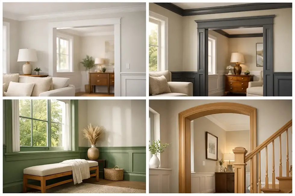
Painted trim is getting more tailored
One of the more interesting shifts this year is how homeowners are treating trim, doors, and built-ins. Bright white trim is still a classic option, but it is no longer the default in every room. More people are choosing softer whites, tonal trim, or trim painted a related shade to the wall color.
This approach can make a home feel more custom and less builder-basic. In rooms with strong millwork, a tonal scheme can highlight the architecture without creating sharp visual breaks. In homes with older trim profiles, a softer contrast often feels more natural and elevated.
The same thinking applies to interior doors and built-ins. Rather than leaving them as afterthoughts, they are becoming part of the color story. A built-in painted in a deep green-gray or a door finished in a warm putty tone can add just enough distinction without overwhelming the room.
Ceilings are no longer always white
Ceilings are getting more attention, and not in a gimmicky way. In 2026, we are seeing more ceilings painted in a lighter version of the wall color, the same color at a reduced sheen, or a deliberately soft neutral that supports the room's mood.
This works particularly well in bedrooms, dining rooms, and rooms with crown molding. It can make the space feel more cohesive and finished. In taller rooms, it can add warmth. In lower rooms, it can reduce the harsh stop-start effect that happens when bright white ceilings sit above warm walls.
It depends on the architecture, though. If a room lacks natural light or has multiple awkward ceiling angles, a contrasting ceiling may still be the better call. The goal is not to force a trend. It is to use paint to make the room feel more resolved.
Low-luster, touchable finishes are having a moment
Color gets most of the attention, but finish is a major part of the story. Interior painting trends 2026 lean toward softer, more velvety looks on walls. Flat and matte finishes continue to appeal because they reduce glare and create a calm, upscale effect.
That said, finish choice should never be made on looks alone. A beautiful matte wall in a formal living room is one thing. A matte wall in a busy kitchen hallway with kids and pets is another. Washability, maintenance, and the condition of the substrate all matter.
This is where experienced guidance makes a difference. The best result often comes from balancing visual depth with real-world durability. Sheen should support the way the room is used, not just the way it photographs.
Kitchen cabinets and built-ins are following the same color story
Cabinet refinishing is no longer separate from the rest of the home's palette. In many projects, the cabinetry sets the tone. Warm whites, mushroom grays, muted greens, and dark natural-looking hues are replacing bright, stark finishes that can feel too sharp against warmer interiors.
Because cabinets live at eye level and take daily wear, this is one area where workmanship really shows. Surface prep, sanding, adhesion, and topcoat selection are what separate a finish that looks elegant from one that chips early or feels factory-wrong in the space.
When cabinet color is coordinated with nearby walls, trim, and even wallpaper or tile, the whole room reads as more expensive. Not louder. Just more considered.
Texture and specialty finishes are quietly growing
Not every trend is about broad wall color. More homeowners are asking for subtle decorative effects that add depth without turning the room into a theme. Limewash-inspired movement, soft brushed finishes, and carefully executed feature walls are gaining interest, especially in entryways, powder rooms, and statement spaces.
The appeal is easy to understand. Flat painted walls can look clean, but texture adds life. It catches light differently and gives the room a more custom feel. The key is restraint. Specialty finishes should support the home, not steal attention from it.
This is also where a painter's artistry matters most. Decorative work can be beautiful, but only when it matches the architecture and the client's taste. The best projects feel integrated, not added on.
How to choose a trend that fits your home
The smartest way to approach trends is to start with the house itself. Look at the fixed elements first - flooring, stone, tile, wood tone, window exposure, and trim detail. Then think about how you want each room to feel. Comfortable and quiet? Crisp and polished? Moody and dramatic? Those goals narrow the field quickly.
After that, test colors where they will actually live. Large samples are worth the effort. Morning light, evening light, lamp light, and shadows from neighboring buildings can all change your read of a color. What feels warm in one room can feel muddy in another.
It also helps to think in sequences, not isolated rooms. A beautiful color can still feel wrong if it fights the rooms around it. The strongest interiors usually have variation with continuity. You want movement from space to space, but not chaos.
For homeowners who care about finish quality as much as color, this is the right time to be selective. Trend-forward paintwork only looks premium when the prep is thorough, the lines are clean, and the final sheen is adjusted with intention. That is the standard we believe in at Artist Painters, and it is why thoughtful painting still changes a home more than almost any quick design update.
The best trend to follow in 2026 is the one that makes your home feel more like itself - just sharper, warmer, and better finished.