12 Best Interior Paint Colors for Homes
- Gene Pellegrene
- May 31
- 6 min read
A paint color can look perfect on a chip and completely different by 4 p.m. in your living room. That is why choosing the best interior paint colors is rarely about chasing trends. It is about finding shades that work with your light, your finishes, your architecture, and the way you actually live in the space.
In Chicago homes especially, light changes fast with the seasons. A color that feels crisp and airy in July can read flat in January. We see the best results when homeowners choose paint with intention - not just a pretty name, but the right depth, undertone, and finish for the room.
What makes the best interior paint colors work
The best paint colors are usually the ones that keep doing their job long after the first reveal. They support the furniture you already own, flatter wood floors and trim, and still feel right morning to night. That often means choosing colors with a little more nuance than plain white or generic beige.
Undertone matters more than many people expect. A soft white may lean yellow, pink, gray, or green. A greige can feel warm and welcoming in one room and muddy in another. If you have stone, tile, cabinets, or stained millwork, those fixed elements should guide the color direction.
Finish matters too. Even the best color can disappoint if the sheen is wrong. Flat can soften imperfect walls, while eggshell offers a bit more durability for everyday spaces. Satin and semi-gloss have their place, especially on trim, doors, and cabinetry, but more shine means more reflection and more visibility of surface flaws. This is where craftsmanship really shows.
12 best interior paint colors worth considering
1. Warm off-white
A warm off-white is one of the safest and smartest choices for open living areas. It keeps a room light and clean without the starkness that can make a home feel cold. In spaces with limited natural light, this family of color often feels more welcoming than a true bright white.
The trade-off is subtle but real. If it turns too creamy, it can start to look dated next to cooler countertops or marble. The goal is warmth with restraint.
2. Soft greige
Greige remains popular because it bridges warm and cool finishes better than many other neutrals. It can work beautifully in hallways, family rooms, and whole-home color schemes where continuity matters.
That said, greige is also one of the easiest colors to get wrong. In low light, some versions go dull or slightly purple. Testing it on multiple walls is not optional.
3. Clean architectural white
For trim, built-ins, ceilings, and some modern interiors, a clean white can look sharp and elevated. It works especially well when the home has strong natural light, dark window frames, or a lot of visual texture from art and furnishings.
This is not always the best wall color for every home. In older spaces or rooms facing north, a crisp white can feel harsh. It depends on the bones of the room.
4. Muted sage green
Sage green has staying power because it reads as calm, grounded, and easy to live with. It works well in bedrooms, home offices, kitchens, and powder rooms. It also pairs nicely with natural woods, brass, black accents, and soft whites.
The best sage tones are muted, not minty. Too much saturation and the room can shift from refined to theme-driven very quickly.
5. Dusty blue-gray
Blue-gray is a strong choice for bedrooms and bathrooms where you want a quieter mood. It carries color without feeling loud and can help a bright room feel more settled.
The caution here is temperature. In already cool light, a blue-gray can read colder than expected. Pairing it with warmer textiles, wood tones, or creamy trim keeps it balanced.
6. Mushroom taupe
Taupe is back when it is done well. A modern mushroom tone adds softness and sophistication that plain gray often lacks. It can be especially effective in formal dining rooms, primary bedrooms, and spaces with layered textures.
This color family benefits from careful testing. Some taupes lean pink, others tan, and others gray. That difference matters once the full room is painted.
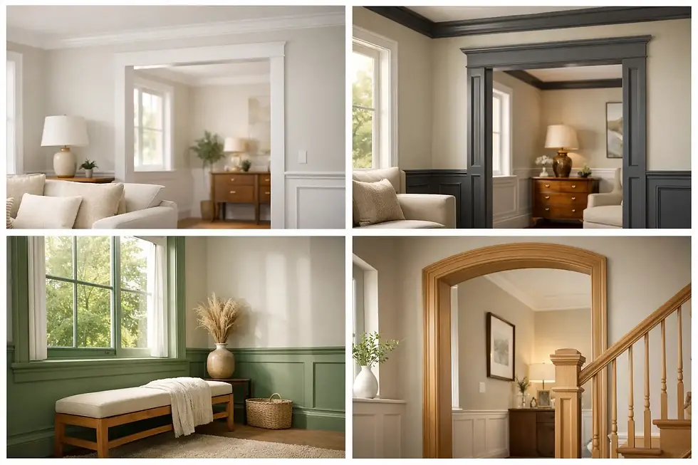
7. Charcoal accent color
Not every room needs a dark wall, but when used thoughtfully, charcoal can look dramatic and tailored. It works well on built-ins, library walls, fireplace surrounds, and powder rooms where a little depth goes a long way.
Dark colors demand strong prep and precise application. Every line, patch, and texture issue becomes more visible, so execution matters as much as color choice.
8. Soft beige
Beige has earned a second look because many homeowners want warmth again. The newer versions are less yellow and more balanced, making them useful for living rooms, hallways, and homes with warm stone or oak flooring.
The best beige does not announce itself. It simply makes everything else look better.
9. Moody green
Deep green can be stunning in dining rooms, studies, and custom millwork. It feels rich, classic, and a little unexpected without being hard to live with.
Because it absorbs light, this color works best where there is enough contrast in trim, lighting, or furnishings. In a dim room with little variation, it can feel heavy.
10. Blush-tinted neutral
A very restrained blush or rosy beige can bring warmth to bedrooms and sitting rooms in a way that feels sophisticated rather than sweet. This is a quiet choice, but often a beautiful one, especially with soft fabrics and warm metals.
It is not for every homeowner or every house. In the wrong setting, it can read too cosmetic. The undertone has to be subtle.
11. Deep navy
Navy is one of the best interior paint colors for adding contrast without going black. It has enough depth to feel tailored and enough familiarity to stay timeless. It works especially well on cabinetry, islands, offices, and accent walls.
Like charcoal, navy rewards good surface preparation. Brush marks, uneven sheen, and poor cut lines stand out fast on darker colors.
12. Earthy clay neutral
Clay-inspired neutrals bring warmth and character to homes that feel too stark or overly gray. They can be excellent in entryways, dining rooms, or spaces with handmade materials, plaster texture, or natural wood.
The key is moderation. A muted clay tone feels grounded. A stronger terracotta can be beautiful too, but it is a bigger design commitment.
Best interior paint colors by room
In living rooms, homeowners usually get the most mileage from warm whites, greiges, soft beiges, and select green-grays. These colors support conversation, daylight, and a range of furnishings without taking over the room.
Bedrooms can handle more mood. Soft blue-gray, sage, taupe, and warm neutrals tend to create a restful backdrop. If the room gets little sunlight, a warmer version often feels better year-round.
Kitchens are more complicated because cabinets, counters, backsplash, and flooring all influence the final result. Wall color has to respect those fixed elements. A white that looks fresh next to painted cabinets may fight with creamy stone or warm wood tones. Cabinet refinishing brings another layer of decision-making, since the sheen and durability requirements are different from walls.
Bathrooms and powder rooms give you more freedom. These spaces can handle darker or more distinctive colors because they are used differently and seen in shorter moments. Rich navy, moody green, charcoal, or a polished soft neutral can all look exceptional when the finish is chosen correctly.
How to choose the right color for your home
Start with the surfaces that are not changing. Flooring, countertops, tile, brick, stone, and stained wood should all lead the conversation. Paint is flexible. Those other elements usually are not.
Then look at natural light. North-facing rooms often benefit from warmer colors, while south-facing rooms can tolerate cooler shades without feeling flat. East and west light shift a lot through the day, so a sample that looks right in the morning may look very different by evening.
Always test large samples on more than one wall. Move through the room at different times of day and compare the color against trim, upholstery, and adjoining spaces. Small swatches are useful for narrowing options, but they do not tell the full story.
Finally, think about finish and wear. A beautiful color in the wrong sheen can create maintenance headaches or expose imperfections that should have been addressed first. Premium results come from the full system - prep, primer when needed, paint quality, application, and finish selection.
When timeless beats trendy
Trend colors can be fun, and there is nothing wrong with using them where they make sense. But most homeowners are happier when the major rooms of the home lean timeless and the personality comes through in accents, cabinetry, powder rooms, built-ins, or decorative features.
That approach gives you flexibility. Art changes. Furniture changes. Families grow. A well-chosen neutral or muted color palette keeps the home feeling current without forcing a full repaint every few years.
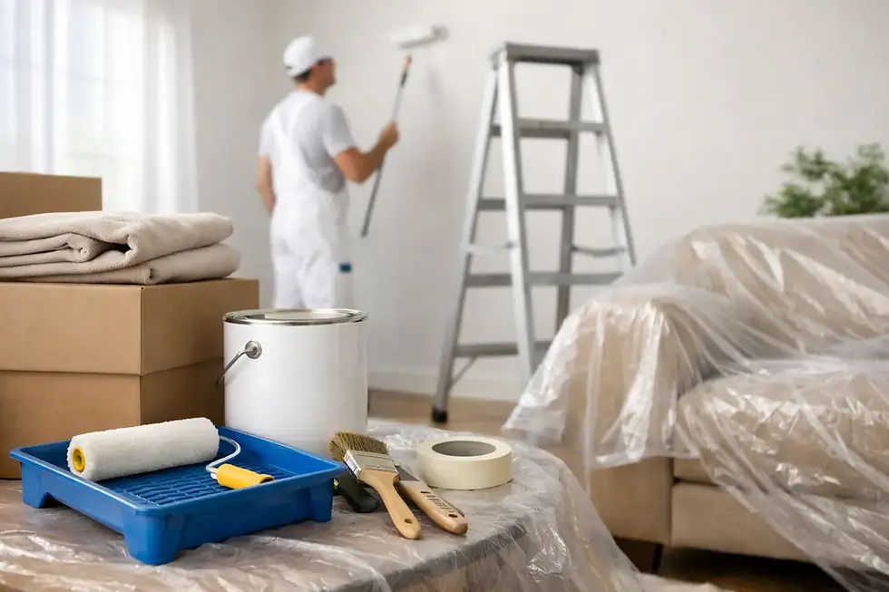
At Artist Painters, we absolutely love painting houses, but just as important, we love helping homeowners make choices they will still feel good about after the ladders are gone and the room is back in use.
The best color is not always the boldest or the most popular. It is the one that makes your home feel more finished, more comfortable, and more like your own every time you walk in.