Interior Paint 2026 Living Room Colors
- Gene Pellegrene
- May 30
- 6 min read
A living room can feel expensive or flat before a single piece of furniture is moved. Most of that comes down to color, light, and finish. If you are researching interior paint 2026 living room colors, the real question is not just what is trending. It is which colors will still feel right in your home after Chicago winter light, summer sun, evening lamps, trim color, and daily life all have their say.
For 2026, living room color is moving in a more refined direction. Homeowners still want warmth, but not the heavy yellow-beige that dated so many interiors. They want color, but not something that feels loud by next spring. The strongest choices are grounded, architectural, and easy to live with. They support the room rather than demanding all the attention.
What interior paint 2026 living room colors are really doing
The biggest shift is away from stark contrast and toward softer depth. Bright white walls with sharp black accents had a long run. In many homes, that look now reads a little hard, especially in living rooms meant for gathering, reading, relaxing, or entertaining. The newer palette leans warmer, more layered, and more forgiving.
That does not mean every room should turn beige. It means color is being used with more restraint and more confidence. A well-chosen muted olive, warm greige, clay neutral, or smoky blue can make millwork look better, art stand out, and upholstery feel intentional. The room feels designed rather than simply painted.
For higher-end homes, this matters. Premium interiors benefit from colors with complexity. Flat, one-note paint colors often look thin on large wall expanses. Colors with subtle undertones tend to hold up better across changing light conditions, which is especially important in Chicago homes where daylight can swing from cool and gray to bright and reflective.
The best directions for interior paint 2026 living room colors
Warm off-whites are still in the conversation, but they are creamier and quieter than the cool whites that dominated for years. These work especially well when the goal is a clean room that still feels comfortable. In a living room with detailed trim, natural wood, plaster texture, or stone, a soft warm white lets materials do the work.
Greige is not gone either. It has simply matured. The better 2026 versions are less muddy and less generic. Think balanced taupe-gray with enough warmth to keep the room inviting. This is a strong choice for homeowners who want flexibility with art, rugs, and upholstery but do not want plain white walls.
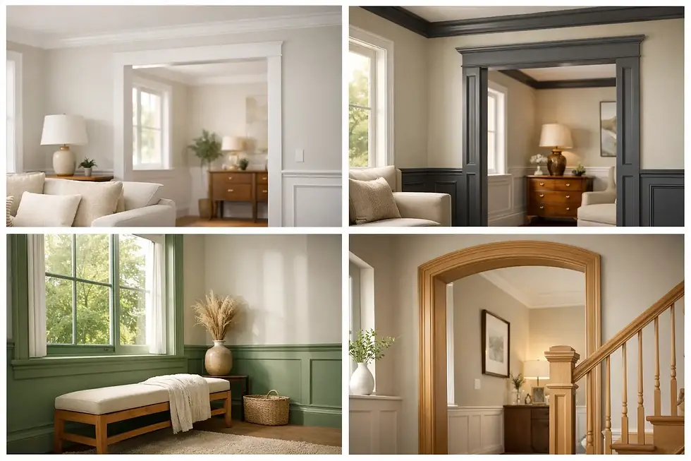
Muted green is one of the most dependable color families for living rooms right now. Not a bright botanical green and not a dark hunter green in every case, but softened olive, sage with depth, or gray-green with an earthy base. These colors pair beautifully with walnut, antique brass, creamy trim, and natural textiles. They can feel classic or current depending on the sheen, the trim color, and the furnishings around them.
Dusty blue and blue-gray are also gaining ground, especially in homes where the architecture can support a slightly moodier envelope. The key is restraint. A smoky, softened blue can make a living room feel composed and elegant. A cleaner, brighter blue often feels less durable stylistically unless the home has a coastal or very contemporary point of view.
Then there are the clay and mineral neutrals - the colors sitting between beige, blush, taupe, and soft brown. These are some of the most interesting options for 2026 because they bring warmth without turning sugary or trendy. In the right room, they create a calm, tailored backdrop that works especially well with layered neutrals and curated furnishings.
Why lighting matters more than the paint chip
This is where many homeowners get tripped up. A color that looks balanced in a showroom or on a small sample can change dramatically on a full wall. North-facing rooms tend to pull cooler and flatter. South-facing rooms bring out warmth. West light can intensify peachy or golden undertones in late afternoon. East light can feel fresh in the morning and subdued later on.
That is why trend reports alone are never enough. The right color for your living room depends on what your room gives back. A beautiful warm greige in one home can look dingy in another. A soft green can feel elegant with warm wood floors and overly gray with cool stone or modern tile.
This is also where professional prep and sampling make a visible difference. Large-format samples, tested at different walls and times of day, tell the truth much faster than a handful of fan deck strips. For homeowners investing in a premium finish, this step is worth the patience.
Finish changes the color more than most people expect
One of the quieter design shifts for 2026 is the move toward lower-sheen, softer-looking walls in living spaces. High shine on walls rarely reads luxurious in a living room. It shows every surface inconsistency and can make even a sophisticated color feel harsher than intended.
In most living rooms, a quality matte or low-luster eggshell gives the most attractive result. The color reads fuller, the walls look more even, and the room feels calmer. Of course, there are trade-offs. Lower-sheen finishes can mark more easily in high-traffic homes, especially with kids or pets. That is where product quality and application technique matter.
Trim is different. If your walls are soft and velvety, a slightly higher sheen on trim can add clean definition without looking flashy. The relationship between wall sheen and trim sheen is one of those details that separates a standard paint job from a carefully finished room.
How to choose a color that lasts longer than a trend
A good living room color should survive more than a season of inspiration photos. It should work on ordinary Tuesday nights, holiday gatherings, bright mornings, and dim winter evenings. That usually means choosing a color with enough character to feel intentional, but not so much personality that it overwhelms the room.
Start with the fixed elements. Floor tone, fireplace material, stone, built-ins, ceiling height, and trim color all narrow the field. Next, consider how you want the room to feel. Relaxed and airy calls for a different palette than intimate and tailored. Then think about what is staying in the room. If you have a statement rug, strong artwork, or inherited wood furniture, the wall color should support those pieces rather than compete with them.
If you are torn between two shades, the better choice is often the one with the cleaner undertone, not the one that looks more dramatic on a sample card. Over a large surface, drama expands quickly. Subtle colors tend to age better.
When bold color makes sense in a living room
Not every sophisticated room needs to be pale. In fact, some of the best living rooms benefit from a richer, more enveloping color. Deeper olive, mineral blue, warm brown-gray, and charcoal-taupe can all be excellent choices if the room has enough architectural interest, good lighting, or a strong furniture plan.
The trade-off is that darker colors are less forgiving of poor wall prep and uneven application. They reveal flashing, roller lines, and patched surfaces more easily. They also shift the mood significantly. That can be exactly right for a formal sitting room, library-like living area, or a home with substantial trim and millwork. It may be less ideal if your main goal is brightness in a compact family room.
Done well, though, a darker living room can feel polished, quiet, and deeply finished. It is one of those areas where craftsmanship is not optional. Surface preparation, caulking, cut lines, and consistency of sheen all show up.
What Chicago homeowners should keep in mind
Regional light and architecture matter. In Chicago-area homes, we often see a mix of traditional millwork, vintage plaster, newer open-plan renovations, and strong seasonal light shifts. That means paint colors have to perform across different conditions, not just photograph well on a sunny day.
Warmer neutrals and muted natural tones tend to have more staying power here because they soften gray winter light and still look composed in summer. In older homes with original trim or detailed casings, they also tend to honor the architecture better than ultra-crisp modern whites. In newer homes, they can add the character that fresh construction sometimes lacks.
This is part of why so many homeowners turn to experienced painters for guidance rather than choosing from trend roundups alone. At Artist Painters, we absolutely love helping clients find colors that suit the house, the light, and the way the room is actually used.
The smartest 2026 approach is not chasing every trend
The best living rooms in 2026 will not be the ones painted in the most talked-about color. They will be the ones where color, sheen, light, and craftsmanship all work together. That might mean a quiet warm white with perfectly balanced trim. It might mean a green-gray that gives the room just enough depth. It might mean a clay neutral that suddenly makes everything in the room look more expensive.
A living room gets used too much to treat wall color like a disposable decision. When the shade is right and the finish is handled properly, the whole space settles into place. That is usually the goal - not a room that shouts trend, but one that feels unmistakably well done.